Every year color trend forecasters- Coloro, WGSN & Pantone release color of the year. Along with a forecast of the color palette that is the most popular each season for interiors, decor,and even fashion!. Key Colors To Pick For Your Home Interiors In 2022. Read on to know what is in store this new year.
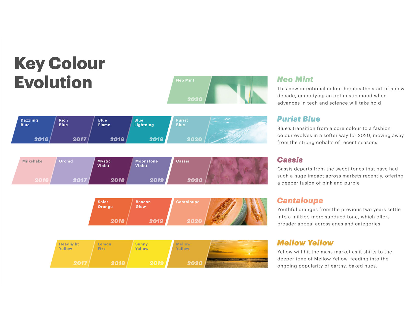
The color trend forecasts are based on a variety of factors. Which includes the current social, political, technological and environmental events of the world. This also includes the psychological effects that these entail upon us. Pantone released its key colour to pick for the year 2022 being the best color scheme for house exterior.
Classic Blue
As opposed to the last year’s energising key colour ‘Living Coral’, Classic blue has an exceptionally calming effect. It symbolises trust and reliability and is often known to induce peace and tranquility.
In terms of trying this elegant, simplistic and classic hue of blue for your home interiors. This gives a bold yet elegant vibe and reflects eccentricity when used in home decor pieces.
Classic Blue- It has a lovely ambiance and a soothing effect.
Neo-mint
This gorgeous hue of green, signifies being closer to nature. This is supported by the concept of Biophillic design and Neotenic furniture and home accessories. These are currently trending in the world of interior design styles and home decor. And it also signifies the start of a new decade, optimism, forward- thinking and futurism. The best color for bedroom walls would be perfect to uplift your room interior design style.
Neo-mint- Desire to be more in touch with nature.
Purist Blue
Purist Blue
A warm hue in the blue family with an ashy finish. This hue is not fresh like the baby blue but has a more saturated and contemporary look and feel. WIth classic blue already in the 2022 colour palette. Purist blue makes a fabulous accent. While the former is a dusky blue, the latter can be the bright and sunny accent. If you are a lover of all things blue, 2022 is your year to revamp your interiors!

Purist blue is an excellent accent colour.
Cassis
Cassis
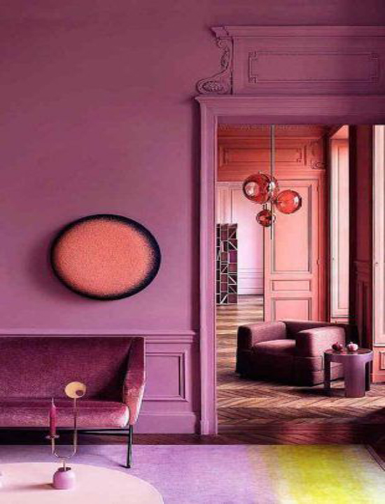
A refreshing fusion of the pink and purple forms this hue. It descends from the bolder violet colour and thus has a little bit of mystery to it. Along with a playful delicacy of a lighter tint. You can go all out in using this colour in the bedroom. As it has a soothing effect. Further accessorizing with home decor in deeper hues and shades of violet would add great character into the room.
Cassis- Pink and purple have a relaxing impact on the eye.
Cantaloupe
Cantaloupe
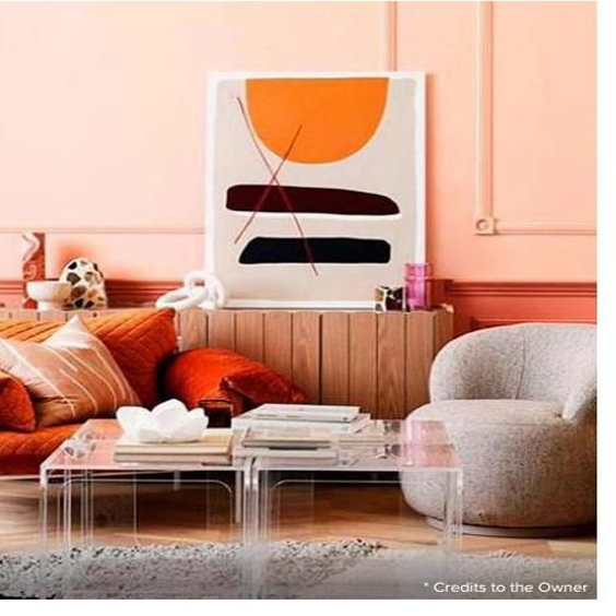
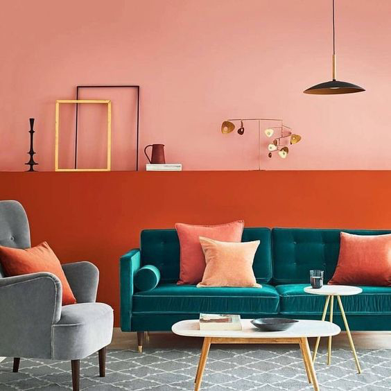
A warmer and lighter tint to Coral, Cantaloupe gets its color from the fruit. It falls on the orange spectrum and is a milkier, warm and subdued tone. The color signifies a fresh, youthful energy and has a feel-good vibe that appeals to a wider audience.
You can incorporate this unique color in spaces like the dining room or opt for a bolder choice by giving one of your bedroom walls a fresh coat in this color. If you don’t want to take a chance with the walls try this shade on your bed quilts.
Cantaloupe- It exudes a cheerful energy and a youthful spirit.
Mellow- yellow
Mellow Yellow
So Yellow, a fashion favourite for quite some time now. This has emerged to be a more earthy and grounded hue this year. Thus becoming popular amongst a wider audience. You can use this bright hue or interior house paint colors pictures to enliven the dull and boring spaces in the house. Perhaps the study. You can even use modest amounts of the hue in home furniture and accessories. This will stand out spaces and bring positivity.
Mellow Yellow colour helps to lighten the environment.


